
Tripa
UX Research I Personas I Sketch I Prototype I UI Design
About
Tripa will be an app where people with different travelling and organisational habits can keep all their tickets and travel plans organised in one place.


The Challenge
Design an app that keeps all the travel plans organised in one place, (including tickets, itineraries, flights etc.), which has other features such as geographical pin drops that enable the users to determine the distance from separate locations as well as find out the best route options and cost estimate to get to their desired destination.
Design an app with some other key features such as the users being able to access the facilities (cafes, restaurants, supermarkets, pharmacies, hospitals) they have close to their accommodation so they can feel comfortable and at ease when they check in; Users being able to access news and updates about the country they are travelling to so they can be well informed about any travel requirements, restrictions, for example.
My Role
This was a self-motivated project under the direction of Daniel Williams, Senior UX Designer and Lecturer at Billy Blue. I was responsible for the pitch, research, experience strategy, design of the app and usability testing. The project was completed in 12 weeks.
User Research
A combination of qualitative (14 interviews) and quantitative research (10 question survey of a 104 people) was conducted to get information about the traveller behaviours, attitudes and goals.
Fourteen people of varying sex, age, profession, relationship status and travelling habits were interviewed over fourteen days. The youngest participant is a 24 year old female and the oldest a 58 year old female. All the interviews were conducted at different locations with each interviewee. Ten interviews were video recorded, and four interviews were audio recorded. All the interviews were transcribed after the interviews.
A ten question survey of a hundred and four people of varying sex, age, relationship status and travelling habits was conducted to gather supporting information to help identify any gaps in the interviews. The youngest participant is 18 years old and the oldest is over 65 years old.
The people interviewed fell into four categories and because of that, four personas were created for a good design process, keeping the user as the first priority.
The main pain points identified based on the user research are:
- Having to find the tickets; information about the trip being lost between emails.
- Remembering what is being booked for what day and having to make a list.
- Losing the messages and links they receive via email/WhatsApp
- Not being able to access the documents digitally due to not having wi-fi or internet reception in certain places.
- Not having all the information easily available about the country visited such as visa information, security, travel bans, vaccinations needed.
- Expending extra money because the information about the distance from airport to accommodation or how to arrive to certain places is incorrect.
- Not having correct information about timetables, queue time to attractions to prevent disappointments on having to miss out on experiences due to a long queue, for example.
- Packing.
- Having to find the tickets, information about the trip lost between emails.
- Remembering what is being booked for what day and having to make a list.
- Losing the messages and links they receive via email/WhatsApp
- Not being able to access the documents digitally due to not having wi-fi or internet reception in certain places.
- Not having all the information easily available about the country visited such as visa information, security, travel bans, vaccinations needed.
- Expending extra money because the information about the distance from airport to accommodation or how to arrive to certain places is incorrect.
- Not having correct information about timetables, queue time to attractions to prevent disappointments on having to miss out on experiences due to a long queue, for example.
- Packing.
The user research showed that Tripa should provide:
- A well organised travel plan and calendar with all the tickets related to the trip organised on the same platform ready to access at any time.
- The ability to access all the information on Tripa online and offline.
- A map that allows to pin different locations visited on each different day and find out the different ways to get there (train, bus, car, walk), cost and distance from one spot to another.
- Information about the country that is going to be visited, this includes, travel restrictions, security, vaccinations needed etc.
- Information about the facilities close to the accommodation, this includes, cafes, restaurants, supermarkets, pharmacies, hospitals.
- Information regarding to the trip that other travellers have shared with reviews to get insights, ideas about what to visit to make the planning easier.
- Must do information from locals.
- The ability to create a packing list for easy packing.
Personas
I used all the qualitative and quantitative data I gathered during the research process to create four user personas, Martha, Andrew, Carla and Monica. Martha is a solo traveller who likes to connect with nature and visit places where the locals go. Martha travels on a budget and doesn’t rely on travel agencies to book her trips. She sometimes organises and plans her trips and some other times she plays by ear. Andrew likes to travel with his partner and friends, he is very organised and does a lot or research before travelling to each destination. He likes to have all the bookings organised in folders and keeps the itineraries and travel information on a spread sheet. Carla is an spontaneous traveller who travels with her partner and sometimes with her family. It is an ordeal when she travels with her family because they can’t agree on what to visit. Carla doesn’t keep her bookings organised and sometimes she has a bit of trouble finding them on her inbox or on WhatsApp. Monica travels with her family and likes to book experiences through a travel agent because she doesn’t enjoy doing research in order to plan the holidays. Monica likes to do unique experiences and would benefit from reviews from other travellers without having to do research because sometimes, she can’t find the experiences she likes through the travel agent.
I used the personas throughout the project to facilitate discussions about my user’s needs, desires, goals and varying contexts of use. The four personas helped me guide design decisions, priorities, and create empathy amongst Tripa and myself throughout the project.


User Flows
In the planning phase, I got a bit deeper into the specifics of planning for Tripa and I created user flows. When I created the user flows, I moved from thinking about consumer needs at a theoretical level to visualising the product and how it would meet those needs. The user flows allowed me to consider how the user would interact with the app and I used them in order to generate, refine, and communicate.
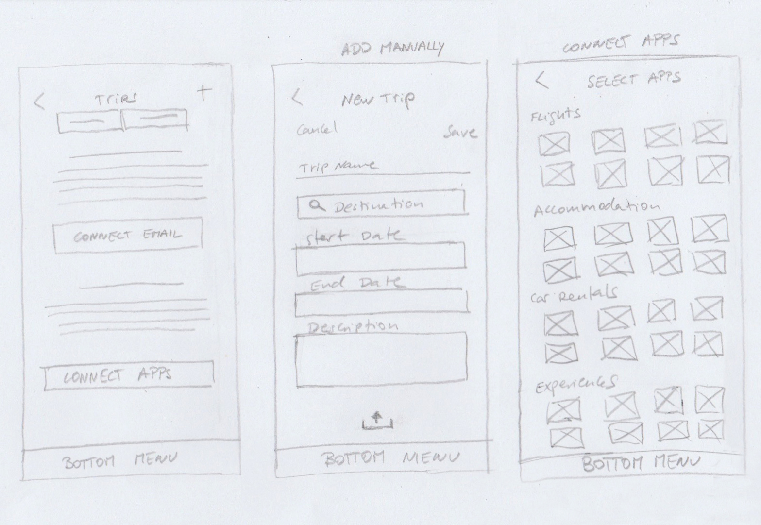
These are some snippets of the user flows:
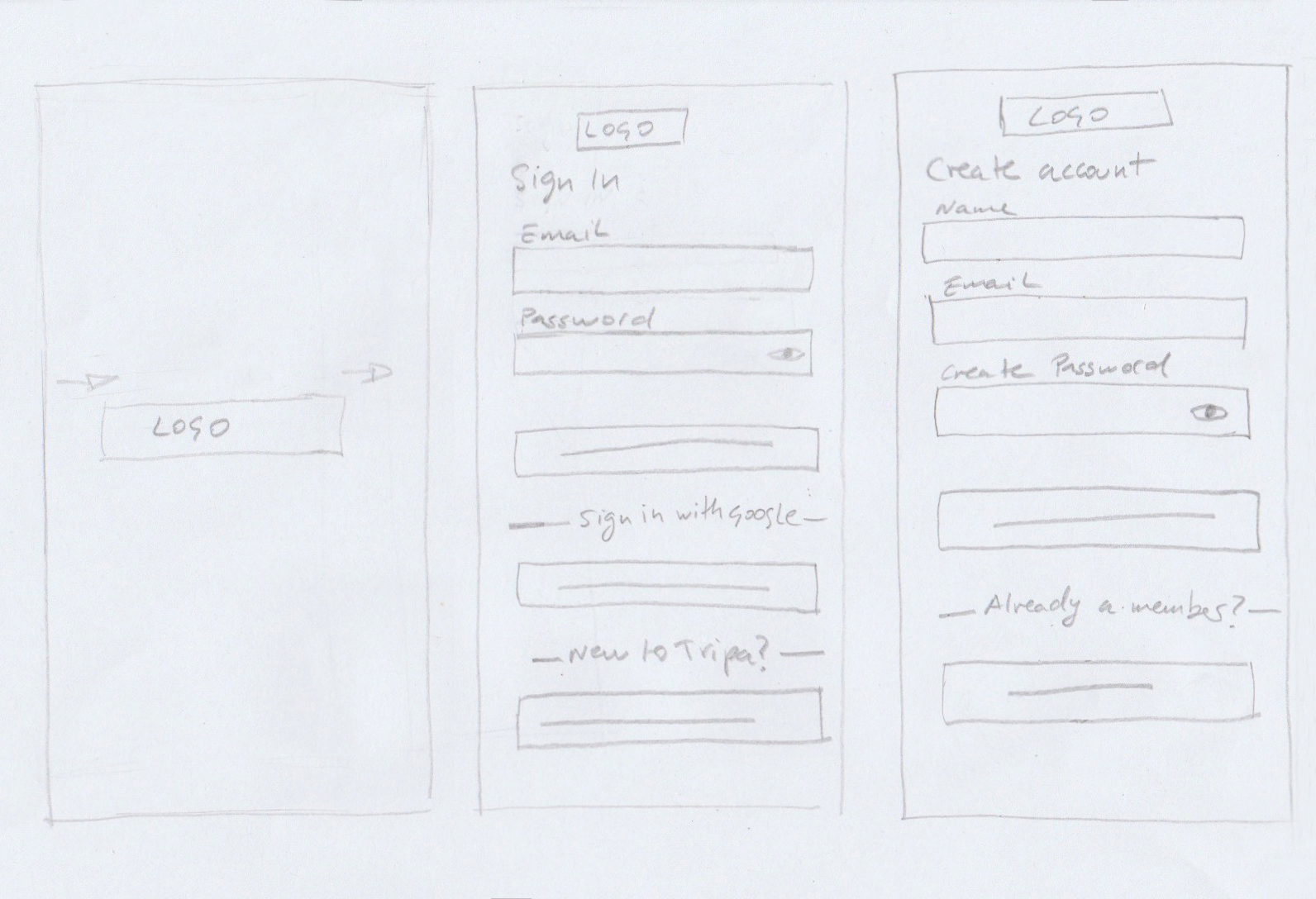
Login / Sign up

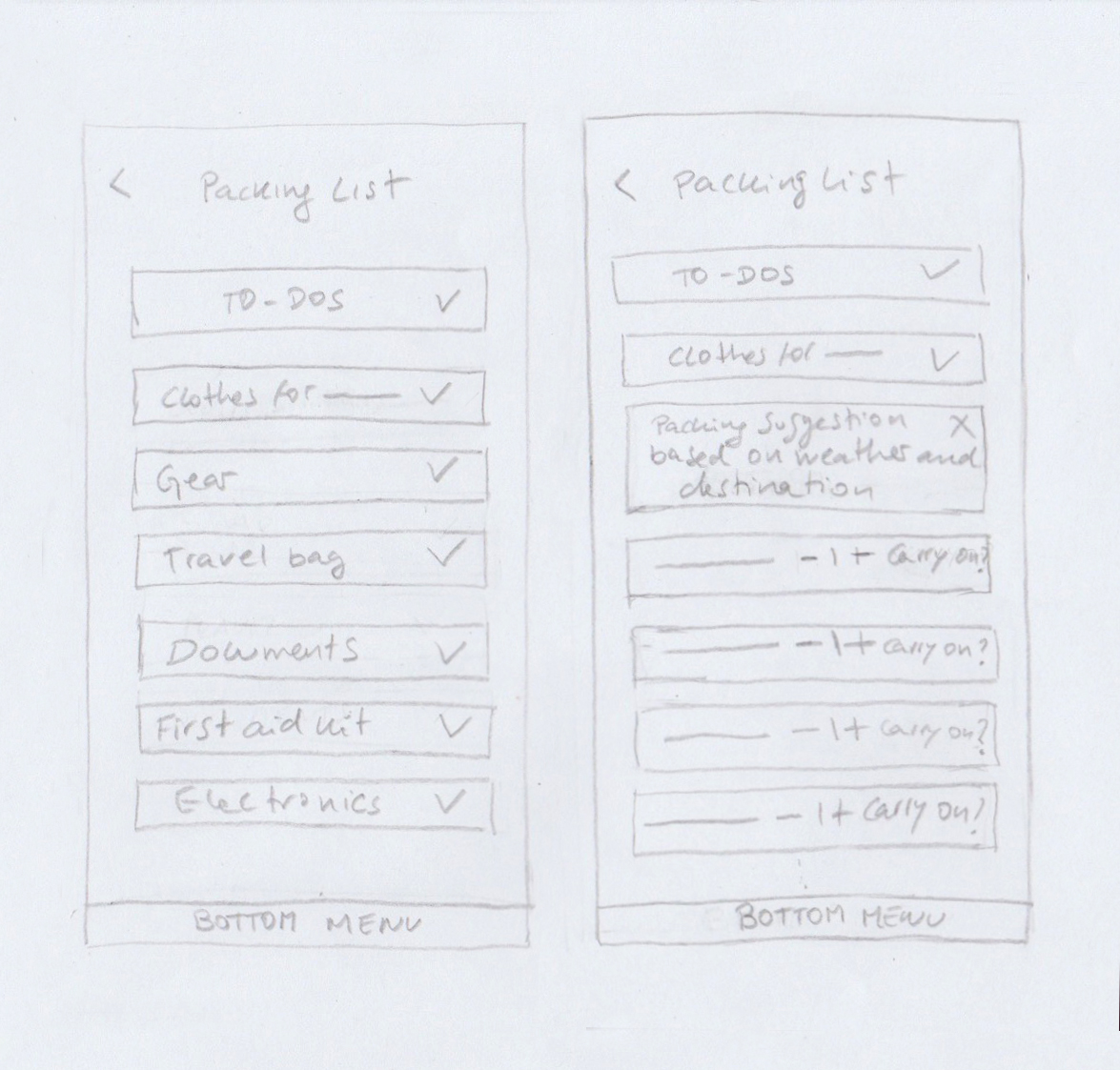
Packing list planner

Prototype
When I defined the primary pathways my personas would explore through the app, I developed several key user journeys to be able to conceptualise and structure the content and functionality. I thought about the user goals, behaviours, opportunities and how the interface would help support the user journey. I designed the prototype in Axure, and because of the tight deadline, I designed a mid-fidelity prototype shown on the video
High fidelity wireframe and user-testing
After completing all the user research and the UX design steps, I conducted user testing with five participants. The user-testing consisted on giving each participants individually five tasks to complete using a non-leading language to test the usability. After that, I defined the looks, the aesthetics, and I brought the App’s personality to life with high fidelity wireframes.
